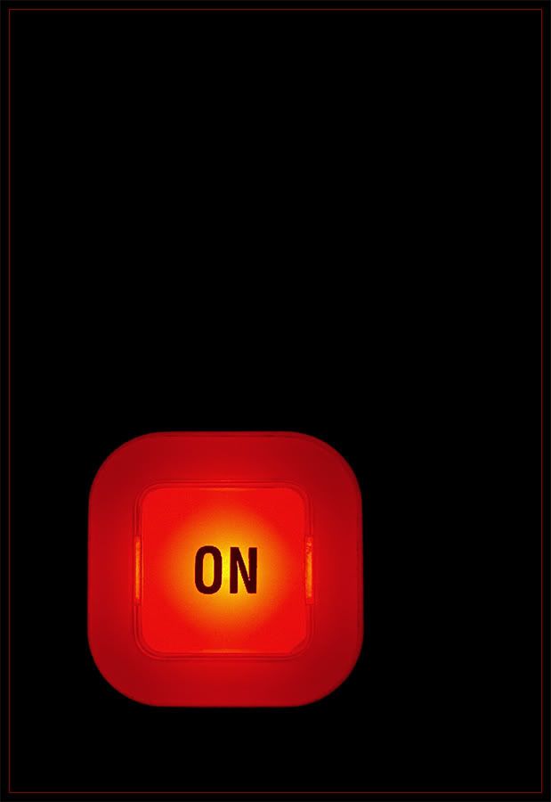
Very effective. The colour against the black background really accentuates the vibrancy of the red. But, it's not quite in the right position for me. I'd be having it more towards the corner.
Bright orange is a great color against black. I am not with SA on the positioning - I like having a wide black frame around it. The border almost looks neon!
Oooh, your photo is a definite "On" and your thin orange frame does wonders in the presentation. Cage's innovative sampling is a great fit though it personnally turns me "off". :)
Oh, I love the negative space and I also think that it is placed in the right spot.. especially considering its size, otherwise the image would feel unbalanced and like it would tip over.. I think it's perfect as it is. Well done!
Technology deals with human as well as other animal species' usage and knowledge of tools and crafts, and how it affects a species' ability to control and adapt to its natural environment. A strict definition is elusive; technology can be material objects of use to humanity, such as machines, but can also encompass broader themes, including systems, methods of organization, and techniques. Wikipedia contributors. Technology [Internet]. Wikipedia, The Free Encyclopedia; 2009 Dec 13, 14:17 UTC [cited 2010 Jan 1].

9 comments:
Very effective. The colour against the black background really accentuates the vibrancy of the red. But, it's not quite in the right position for me. I'd be having it more towards the corner.
Bright orange is a great color against black. I am not with SA on the positioning - I like having a wide black frame around it. The border almost looks neon!
Oooh, lovely bright glow in this one and I like the off-centre positioning from both directions. It's very Zen! Nice work!
Oooh, your photo is a definite "On" and your thin orange frame does wonders in the presentation. Cage's innovative sampling is a great fit though it personnally turns me "off". :)
Oh, I love the negative space and I also think that it is placed in the right spot.. especially considering its size, otherwise the image would feel unbalanced and like it would tip over.. I think it's perfect as it is. Well done!
Very minimalistic & good composition. I love it.
Love this one in all aspects, simple, colorful, minamilism, negaive space...kudos MadaamMtnLion
What a wonderful image. I especially love the yellow glow smack dab in the center of the button.
A very nicely presented "on"!
Post a Comment